The Push and Pull Between Sad and Shouting Sameness
Late stage Millennials, RU OK?
And AI Making It So Much Worse
USP. Point of Difference. Joy. The ‘good’ kind of attention grab.
Life. Warmth. Creativity. Soul. Affection for a brand.
These are the things that I, as a consumer of both products and services and the advertising itself, am craving today, while there seems to be two extreme opposing aesthetic ideals at play, tugging our response instincts between dreadfully dull and loudly derivative.
Dust to Dust
The former, the drab aesthetic trends that were born in places like TV ads for Daylesford tourism (‘Down to the River to Pray’, IYKYK) in 2009 are still alive and well, although only alive in the place where trends go to die: the low-to-mid-budget department store.
Those astroturf-covered décor items from the 2010s? Left the building via Anko. Scandi-style wooden desktop stationery sets? Impractically flat timber cheese paddles? The same fate. Dead, via big box retail saturation.
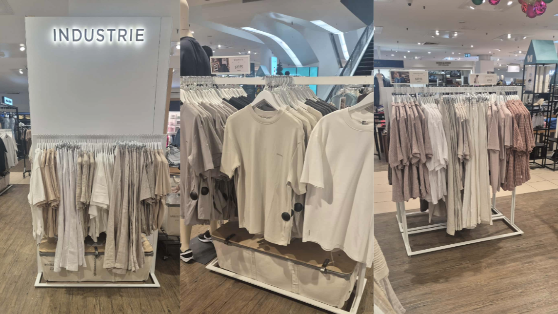
But Millennial ‘sad beige’? No, that’s still here in clothing fashion, stubbornly available in the form of print-less boxy t-shirts, in Fifty Shades of Dust and Clay, thanks to the likes of Industrie (whose clothes I do buy a lot, because they know how to tick all the boxes for fit, comfort and tail-end-of trend late-to-the-party relevance).
And I think this has aligned with similar changes in business and corporate within roughly the same decade — the need to simplify branding and subsequent messaging on socials and other marketing channels. Referred to as 'blanding' (courtesy of this great article by March Branding). Minimalism, likely as a result of the cluttered aesthetic of the generation before.
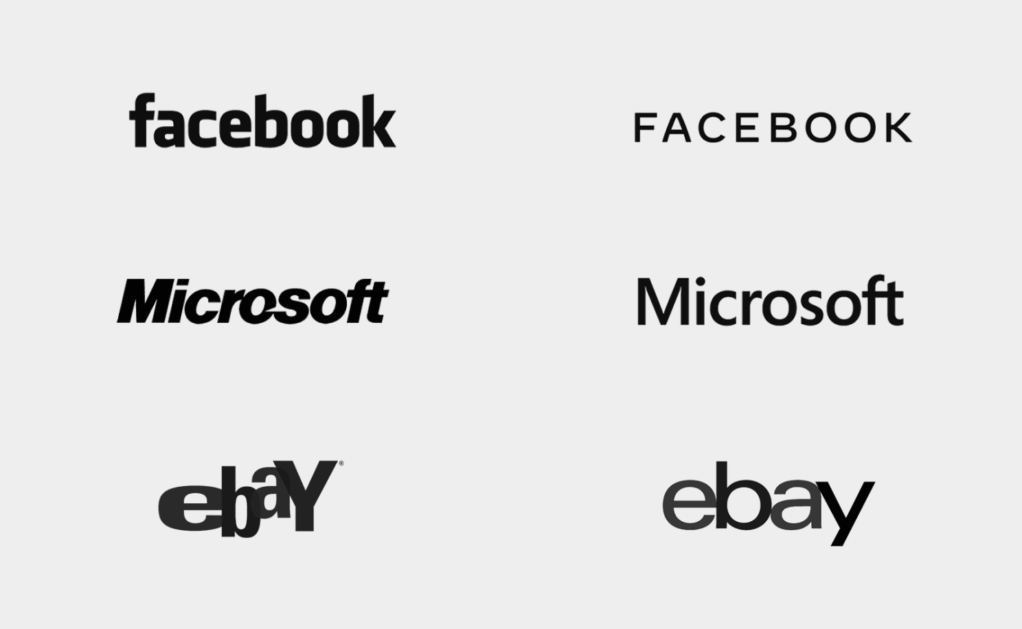
Colours = pretty much gone. Edge = less. Image credit: March Branding.
The Collective Safety Zone
I think it’s both a metaphor for, and a closely linked phenomenon to, the fervour for the use of AI.
For marketing purposes especially, we tend to reside at either outer extremity of the aesthetic divide when prompting this tech — mumbled earthiness or (and I’ll get to this later) loud with bright white teeth and mangled hands.
It’s not just the ease of which a non-creative can generate promotional assets, but it also provides a certain emotional safety for not standing out (too much). For some reason, many small business owners are hesitant to be bold (and yeah, I know, they are saving thousands of dollars on not hiring creatives).
A strange corporate shyness, if you will, for wanting to actually blend in with competition and the fear of overstepping the creativity line and looking silly.
A White Guy’s Blues Gig and His 1940s African American Poster (and Other Bad and Cliched Ideas)
And of course, the latter — at the other end of the spectrum, the fact that AI currently has its own certain ‘aesthetic’, especially for things like local gig ads in the music industry, Lord help us: dark, warm orange-y hues, brush script and 'wild west' fonts and worst of all, hyper-real adjacently dystopian rendering of inanimate objects, humans and other living beings means that the more people use it, the less they’ll…stand out. And again, the teeth and the hands; the stuff of nightmares.
The initial honeymoon period of just a few folks using AI to stand out amongst the less professional-looking Microsoft Paint users in small business, has now given way to a majority collective genericness devoid of any human personality or, again, a Point of Difference, because now we’re heading towards the majority of business owners (and band leaders) using it.
It’s only unique when it’s rare. And currently, it certainly ain’t.
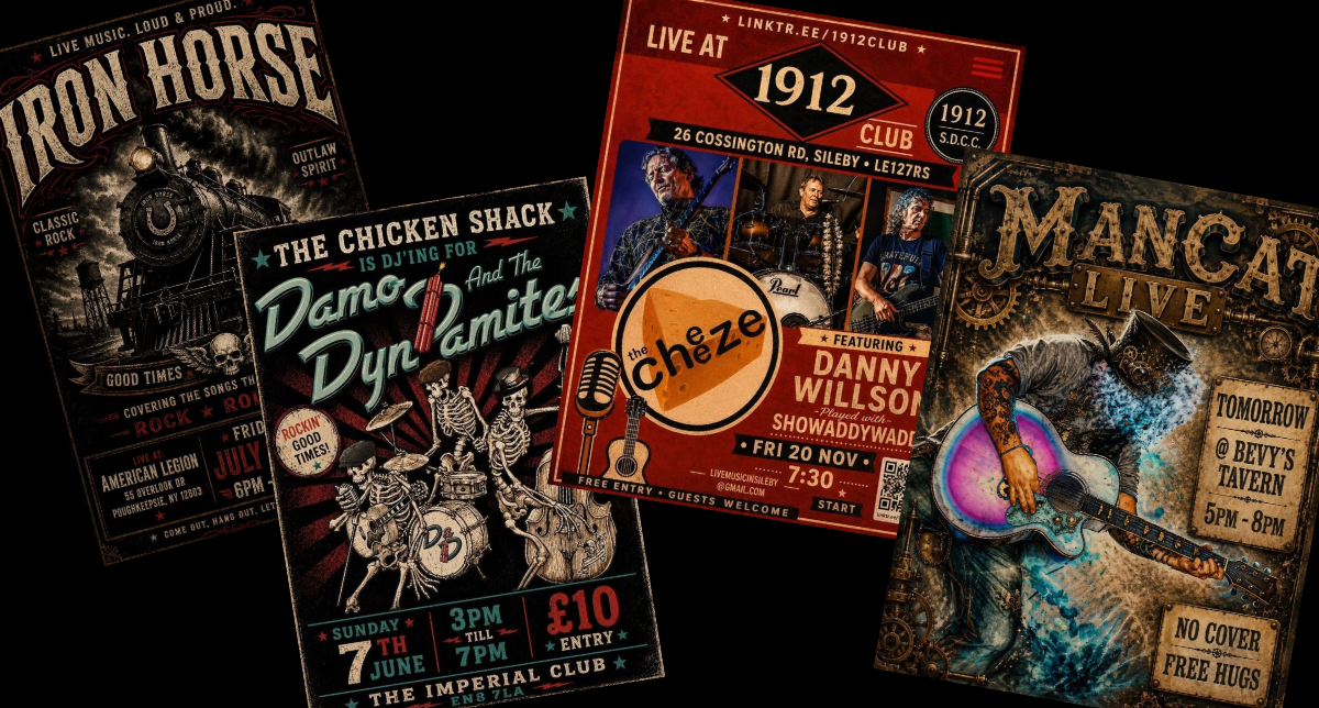
Musos and Venues with ChatGPT: You're KILLING Me.
Colour Me Glad
Right now, I’m asking, can we find the middle ground between dull brown gouache and caricatured gaudiness here? And can we go back to just having a good honest crack at human self-initiated design that uniquely and truly represents your enterprise?
Even a photo of a napkin with gig details hand-scrawled on it will pique my attention and pull at my heart strings more than AI-generated (I will NOT say ‘made’ or ‘created’) bit of slop on an event post on Facebook.
I guess what I’m trying to say here, is many of us as humans are now also depriving ourselves of the joy of creating, so that joy and genuineness can be communicated to the consumer in our advertising. And we get a hall pass to flinch away from interesting and imperfect ideas, because safe dull or same-same hyper ones are a big deal right now.
Prompting Humans Instead
I get it, if I worked for a construction supplies company (I did) and had to write 300 descriptions about bolts, their shear force resistance and pull-out strength in kilonewtons (I did), I’d now be straight onto CoPilot with a list of web links, and saying, “Robot, do the boring stuff for me.”
But is there any creative joy left for us in our work? Or are we destined to outsource the joyful bits to an AI agent, and then drive another light silver Camry to our monochrome AirBnB for a weekend of lite milk-level recreation (or get slowly adult-baptised in Daylesford on a—you guessed it—dull day)?
Because given the chance to research and write and create assets for an interesting subject matter, it’s ‘slow art’ creation I’ll be engaging in, even if I spend some non-chargeable hours on it.
I Don’t Know Where to Look
The beigeness has found its way into the design room for consumer products: pulling back the saturation on garments, unifying the headlight shape and Duco colour on vehicles with all other manufacturers, and monochrome-ing the absolute living daylights out of furniture and décor.
Put this side-by-side with yell-fest AI gig ad garbage I’m seeing on socials right now, and it feels like my brain has been fed both a sedative and a long haul truckie pill at the same time, and they are fighting it out as I mentally walk away from both.
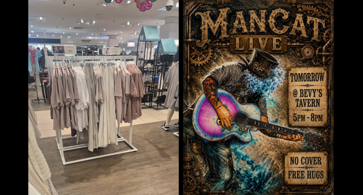
I can't even, with either of these aesthetics. And we think both are good for conveying a human brand?
While the generative AI juggernaut gains speed at a million swimming pools of Murray River water an hour, and our big scary world seems to push us into the safety of our homes with non-threatening hues as our security blanky, when are we going to stand up and say, “No, I’ll draw this one; I’ll write this one, I’ll design this one, even if it makes me look a bit amateur in the short term”?
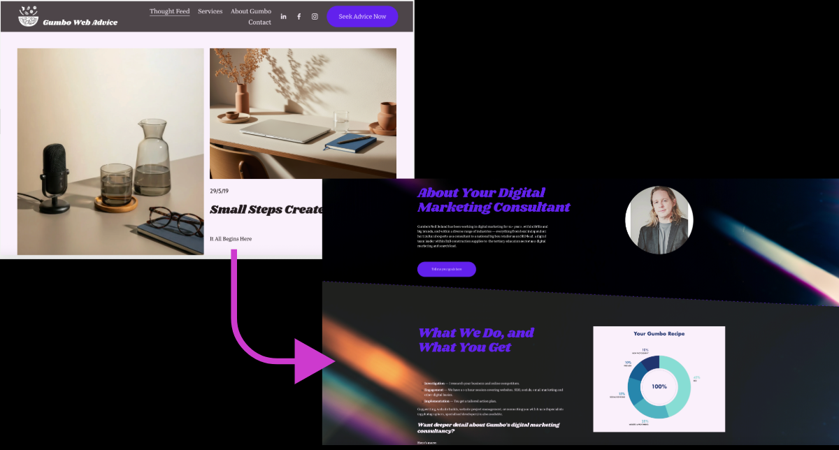
Funny: it was a very dusty sad beige aesthetic theme I found attractive on Squarespace for my website (below). But it's 'What I've done with it." — Darryl Kerrigan, The Castle.
No Thanks, AI, I’ve Got This
I think it’s already time to give the gift of creative joy back to ourselves within our workday, and within our hobby hours. The gift of the process. And hell, it might take a little longer, but the mental stimulation and friction is healthy. The robots can’t feel that joy anyway. Add a stupid rainbow; you can always delete it. Use too many fonts; you can always pair it back to ‘best practice’. Get weird.
The community needs us to do this, too. The more daring creative output smelling salts that jolt us all out of home-bound potato-ness and shows that brands are willing to convey love to receive love. So find love in the process, create with love, and let to robots process the non-feeling stuff.
Now, I’m off to eBay to see if there’s a vintage 1992 fluro Hot Tuna t-shirt under $300. No beige or ye olde avatars, thanks.
